
KPI: output
The Output is the number of good products produced (not scrap).
1. Output (quantity) by month
Short description: The number of good products produced each month
Who uses it (importance): higher management (High), factory management (High), unit management (High)
Description: The number of goods the factory delivers in terms of the factory main units: kilogram, number of products, time (in case it is a time service organization), etc.

Data tips: The number of bars depends on what you want to show. I found 5 quarters to be useful because you can see what happened last year and you can see if there is a seasonal pattern.
Design tips:
- Never have more than 5 figures. 4 is better. Use the axis parameters to go to thousands or millions.
- Remove the horizontal lines when you add labels.
- Use labels with fill color so that you can easily understand the figures even if they’re shown on a different background.
- Use the units in the headlines so that the reader can easily understand the units
2. Output ($) by month
Short description: the number of good products produced each month times the sale price of the unit.
Who uses it (importance): higher management (High), factory management (High), unit management (High)
Description: This shows the output of the factory in terms of money. Sometimes the quantity output will show a decline while the Output ($) will show an incline. It will happen when the factory will produce a more complex product and get more money per unit for it. For example, in a soft drink company the amount of liquid produce will decrease if the factory goes from 2 liter bottles to 0.3 liter cans. But the cost per liter in cans is much higher. That is why we need to see both KPIs – to understand the whole picture.

3. Output (quantity) by tool – current month
Short description: the number of good products produced by each machine this month.
Who uses it (importance): higher management (low), factory management (High), unit management (High)
Description: Shows the quantity produced by each tool last month. If you add up all the tools, you will get the last bar of the output (quantity) by month. That of course is very important for the factory management.

Design tips: Sort the tools by the output it produces from top to bottom.
4. Accumulated output by tool by year
Short description: the accumulated number of good products produced by each tool each year (in the same time period).
Who uses it (importance): higher management (High), factory management (High), unit management (High)
Description: The accumulated number of products produced by each tool since the beginning of the year, compared to the same value last year at the same period of time. For example, if the current month is July, each tool will show the sum of production from January to July this year compared to last year (from January to July). This data let the management understand whether a tool is getting better or not. The differences can also be explained when the tool is producing a different mix of products (slower or faster products). This data will reflect major improvement done to a tool.

Data tips: If there are fewer tools, you can add another year for the comparison.
Design tips:
- Sort the tools by the output they produce from top to bottom.
- Use different colors for each data label year.
5. Accumulated output by year
Short Description: the accumulated number of good products produced each year (in the same time period).
Who uses it (importance): higher management (Med), factory management (Med), unit management (Low)
Description: The accumulated output since the beginning of the year until the current month compared to the same time period in different years. The 2 graphs give the quantity dimension as well as the money dimension. By looking at the graph it is very clear whether revenue increases during the years and whether the factory produces more or less. As mentioned above, the money dimension usually holds the difficulties to produce premium products that get higher revenues. Example: when looking at the attached graph we can see that the factory produces much more than 2009 but every year the increase is at a single digit % increase, but still an increase (except in 2011). Looking at the money dimension we can see that the increase in revenue is much more than a one digit %. We can also see a decrease in revenue in the last year. So only the 2 graphs can tell the story.

Design tips:
- Make sure that the labels are not more than 4-5 numbers. If necessary, change the axis to Thousands or millions. Make sure that you write the new units on the axis and in the title.
- If the changes are not clear, start the axis not on zero as shown on the quantity (left) graph above.
6. Difference in output: Current vs. previous month by tool
Short description: the number of goods produced this month vs. last month.
Who uses it (importance): higher management (low), factory management (Med), unit management (High)
Description: For each tool calculate the difference between the goods produced this vs. last month. The graph shows at a glance which tool did better and which tool didn’t. This graph can also be shown in a percentage version.

Design tips:
- Sort the differences from high to low.
- Make sure that there are not more than 3-4 figures per label (use thousands or millions on the vertical axis)
- Lower the Horizontal axis to the bottom of the graph.
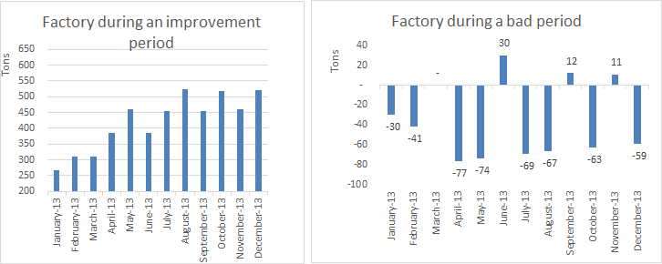
7. Factory/tool output differences from previous month
Short description: changes in output between months
Who uses it (importance): higher management (Med), factory management (Med), unit management (Low)
Description: Show only the differences between months (can also be a different time period). This can apply to a factory output or a tool output. For example: If the previous month was 200 and the current month is 220, the value shown in the graph will be 20. The graph gives you a very quick view of whether the factory/tool that is being measured is getting better or not. If the graph is usually positive, there is continues improvement. If it is usually negative, something is not working well. Most factories look like the first graph, up and down. But this KPI can easily let the reader understand the state of the factory/tool. This graph can also be made using percentages. Take the current month’s output, divide it by the previous month, and subtract 1 to get the changes (% = (current month/previous month)-1)
This graph is different from the “difference in output graph” because it changes in time over 1 factory/tool while the previous graph shows many tools on only one time period.

8. % of batch improvement (vs. the last batch) Advanced
Short description: % of batches that improved the output per hour from previous similar batch – by factory/tool.
Who uses it (importance): higher management (Low), factory management (Med), unit management (High)
Description:
The product mix affects the monthly output, some products have more output than other products.
How do we know whether we are improving?
We will look at goods per hour per batch and compare it to the previous batch with the same product running on the same tool. We will mark it by 1 if it is getting better, -1 if it is getting worse, and 0 if it stays almost the same. Then we add all marks and divide the result by the number of batches. The result will be the percentage of batches that improved from previous production.
The calculation goes like this (assume 10% = Same output):
X = (Current output per hour / Previous output per hour)
- X > 1.1 Mark = 1
- X < 0.9 Mark = -1
- 0.9 <= X <= 1.1 Mark = 0
Sum all X per batch and divide it by the number of batches per month
Example:


9. Average daily output per month
Short description: average daily goods produced daily (Only working days)
Who uses it (importance): higher management (High), factory management (Med), unit management (Low)
Description: The number of goods produced every working day on average. Since the factory is not working all the time, we need to take the output per month and divide it by the number of hours the equipment should have worked. If there was a scheduled stop, we don’t take it into consideration, then divide by 24.
Average daily goods = (Monthly goods) / (Scheduled working hours /24)

10. Tool average output per day – current month by year
Short description: average daily goods produced by tools compared by year.
Who uses it (importance): higher management (Low), factory management (Med), unit management (Med)
Description: The average goods per day produced this month compared to the same month each year. This KPI lets us see if a tool is producing more or less each year. If it produces less, then there must be a change in product mix or it needs to be monitored to understand why. If the tool produces more, then we are doing something right.
This KPI can also be shown as accumulated daily goods since the beginning of the year compared with the same period each year.
Average daily output by tool = goods produced by tool / Available working hours / 24


Design tip: Sort the tools either by goods this month descending or by total of all year descending.
